TRONTEQ Unveils New Logo: That’s What It Stands For

We at TRONTEQ are specialists for the networking and digitalization of public transport vehicles. In order for the TRONTEQ brand to express this even better, we are now presenting ourselves with a new corporate logo.
Content
From Electronics to Public Transport
When Eugen and Juri Martinevski founded TRONTEQ Electronic in 2011, the company’s primary goal was to provide excellent Ethernet solutions for industry. Over time, the company has specialized exclusively in the production of Ethernet switches for public transport buses and trains. Public transport companies, public transport operators and system integrators are now our close customers. Our services and values are exclusively aimed at fully satisfying this target group.![]()
New Logo Reinforces Vision and Role in Public Transport

Young, forward-looking, always on the move and connected – all under the sign of TRONTEQ. These characteristics are reflected in the new logo and underline the values that TRONTEQ’s customers have come to appreciate over the years.
![]()
TRONTEQ stands “For Connected Public Transport.” Because when developing our Ethernet switches, we always have one goal in mind: to make public transport more connected and passenger-friendly. “And we want everyone to know that,” says Managing Director Juri Martinevski. “That’s why we created the slogan “For Connected Public Transport”, which is now a permanent part of our company logo. We are no longer TRONTEQ, the electronics provider. TRONTEQ is a specialist in IP networks for public transport. TRONTEQ’s products enable the networking of public transport.”
![]() Green means go: TRONTEQ’s signature light green color, which has always stood for dynamism, innovation and a proactive approach, continues to be present in the logo. The circular graphic in vibrant green represents our technical expertise, but also our mission to advance the connectivity of public transport. The starting and arrival point of this stylized route network map is the beveled line at the bottom right – an imaginary train station and an allusion to the distinctive letter Q from TRONTEQ’s lettering. In other words, sophisticated electronics and smart networking under one roof – TRONTEQ’s roof.
Green means go: TRONTEQ’s signature light green color, which has always stood for dynamism, innovation and a proactive approach, continues to be present in the logo. The circular graphic in vibrant green represents our technical expertise, but also our mission to advance the connectivity of public transport. The starting and arrival point of this stylized route network map is the beveled line at the bottom right – an imaginary train station and an allusion to the distinctive letter Q from TRONTEQ’s lettering. In other words, sophisticated electronics and smart networking under one roof – TRONTEQ’s roof.
What’s Next?
The new logo not only represents TRONTEQ’s current values – it also makes a statement about the company’s continued development. And as we continue to open up new markets on new continents and network more and more buses and trains with the help of our ROQSTAR switches, we will gradually replace our previous logo with the new one.
More Stories Like This:
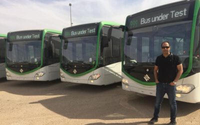
ROQSTAR Ethernet Switches Enhance Connectivity in JCV’s EvoBus Vehicles in Riyadh
In a strategic collaboration, TRONTEQ has partnered with Juffali Commercial Vehicles (JCV), the sole agent and distributor of Mercedes-Benz trucks and buses in the Kingdom of Saudi Arabia and the authorized distributor of Fuso trucks and buses. The...
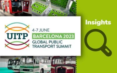
Vehicles as Data Centers: Insights from UITP Global Public Transport Summit 2023
The UITP Global Public Transport Summit 2023, held in Barcelona, Spain, brought together industry leaders, professionals, and organizations to get industry insights and network with peers and customers. Among the distinguished participants was...
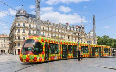
Transforming Montpellier’s Trams with ROQSTAR Ethernet Switches
Montpellier, France Vehicles: 86 tramsPerformance: 100 million passengers per yearObjectives: Carry out the digital transformation of the fleet in order to standardize and modernize current and future telematics Increase passenger satisfaction with...